Watch Dial Colours Trending in 2026—and How to Choose One You Will Keep
Colour is stronger across 2026 watch releases, but a lasting choice starts with wardrobe, light and legibility.
Blue and green remain easy colour entries, while burgundy, pastel and stone-style dials create more personality. Choose by repeated wardrobe compatibility and legibility—not by a studio image alone.
Bucherer’s 2026 trend review points to precise use of colour, while Watches and Wonders coverage highlights stone dials. Market data adds an important correction: buyers still frequently choose familiar 40–41 mm steel watches in black, blue and silver.
Colour is expanding, not replacing classics
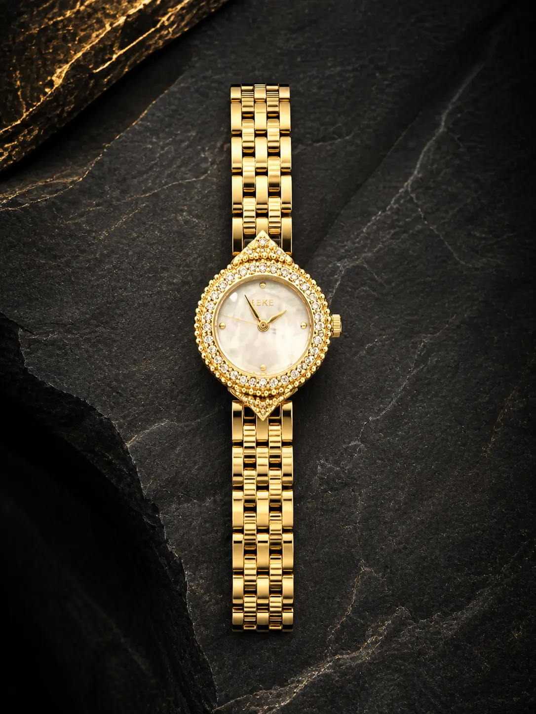
Emerald, burgundy, ice blue, salmon and natural-stone effects are more visible in current releases. Colour is being used as a dial material story, a textured finish or a focused accent rather than only a loud novelty.
That does not make black, silver and navy outdated. Neutral dials remain useful because they create contrast, suit more straps and are easier to repeat through work and formal settings.
Start with colours you already repeat
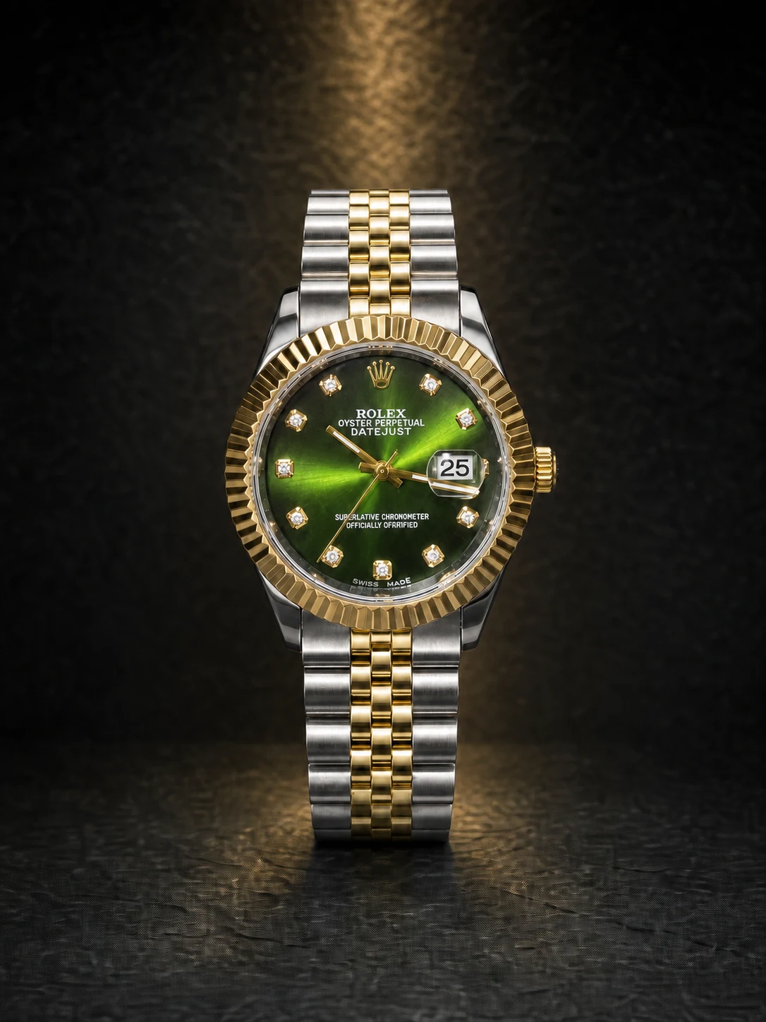
Look at shoes, belts, jackets and formal clothing you wear most. Blue works comfortably with navy, grey, tan and denim. Green pairs naturally with earth tones and can still read neutral when dark. Burgundy suits brown leather, charcoal and cream but makes a clearer statement.
If the watch is your only piece, ask whether the dial works with ten real outfits. If it is part of a collection, the colour can fill a gap rather than cover every occasion.
Finish changes the colour
Sunburst, lacquer, matte texture and stone surfaces react differently to light. A dial that looks bright in a product image may appear nearly black indoors. Request natural-light photographs or video of the exact variant when colour is the deciding factor.
Confirm that edited campaign photography and the actual product variant use the same dial finish and reference.
Contrast matters more than trend
Hands and markers should separate clearly from the dial in ordinary indoor light. Strong colour with low-contrast hands can look excellent in a photograph and frustrate in daily use. Check lume only if night reading matters to your routine.
Buy the colour, not the headline
A trend article can explain why a colour is visible now; it cannot predict what you will enjoy in five years. Choose the dial that makes you want to wear the watch, then verify fit, movement and service just as carefully as you would with a neutral model.
Turn the guide into a shortlist
Use Watcher’s live filters, then verify the exact product code and specifications.
How this guide was prepared
The Watcher Editorial Desk separates general guidance from model-specific claims, uses current manufacturer or industry sources, and avoids inventing prices or specifications that can change. Always verify the exact product reference and manual before purchase or water exposure.
- Bucherer — Watch trends 2026 — Retail trend overview covering smaller proportions, slimmer cases, colour and dial-side mechanics.
- Bezel — H1 2026 watch market trends — Marketplace evidence contrasting editorial trends with buyer activity by size and dial colour.
- Chrono24 — Watches and Wonders trends 2026 — Industry-event trend review covering integrated-bracelet sports watches and stone dials.
Common questions
Is a green dial versatile?
Dark green can behave like a neutral, especially with steel, black, brown and earth tones.
Which dial colour is easiest for one watch?
Black, blue, silver and white are usually the simplest to repeat.
Do stone dials look identical?
Natural material can vary. Confirm whether the photographed pattern represents the exact watch.